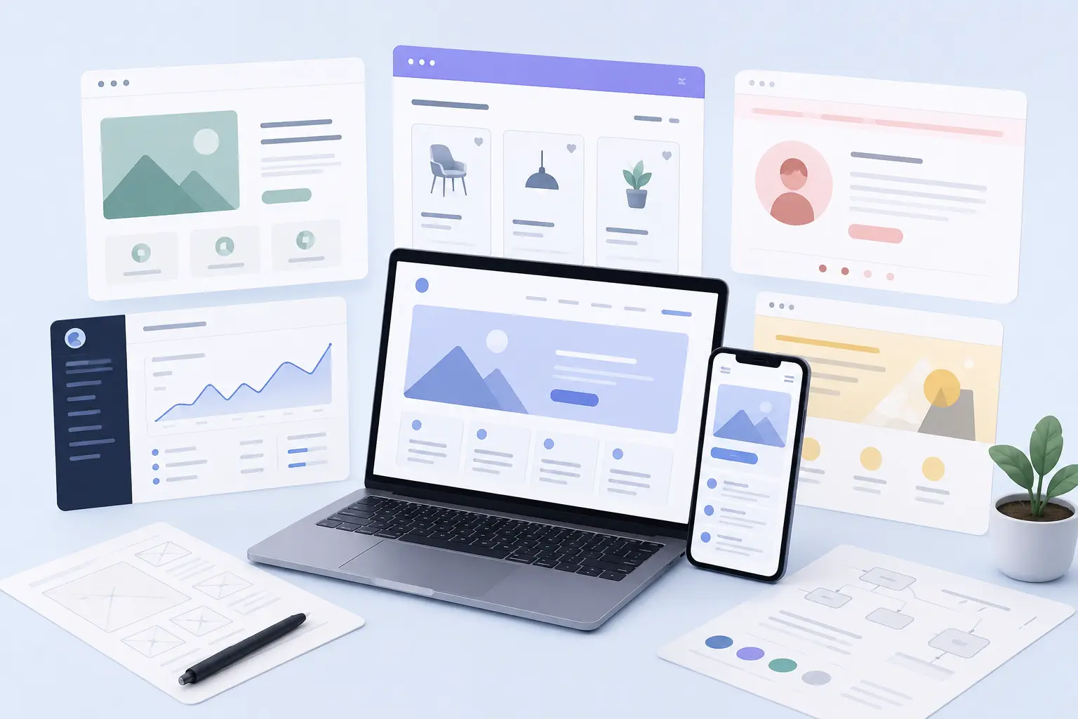
The 17 website design examples below show how different brands use layout, typography, navigation, visuals and interactions to support specific user goals.
Each example offers a practical reference for page structure, content hierarchy, responsive behavior and conversion paths. The selection covers B2B, healthcare, ecommerce, SaaS, agency and portfolio websites.
Use these examples to study how successful sites present their value proposition and organize important information. You can also assess mobile layouts, accessibility, page speed and interaction patterns before planning your own website.
Focus on the design choices that support the intended audience and business objective. This approach helps you identify useful patterns without copying an entire visual style.
Website Design Examples Comparison Table
The 17 website design examples showcase different approaches to visual style, navigation, interaction, content structure, and user experience. These examples cover ecommerce, SaaS, B2B, consumer, media, travel, and creative websites.
The table below compares 17 website design examples by design style, key features, and primary use case.
1. Apple
Apple uses minimalist, product-focused website design with generous whitespace, high-resolution imagery, and subtle scroll animations. The layout keeps product information clear while reducing visual distractions.
The site combines concise copy, interactive product displays, clear navigation, and responsive layouts. Its structure supports both product storytelling and ecommerce goals across desktop and mobile devices.
Best for: Brands seeking minimalist, product-led design with premium visual storytelling.
Design Style: Minimalist, product-focused.
Key Features: High-resolution imagery, scroll animations, clean navigation.
Location: Cupertino, California, USA.
2. Stripe
Stripe uses developer-first website design with clean typography, interactive code examples, and modular layouts. The structure presents technical information clearly while supporting marketing content and developer workflows.
The site combines clear information hierarchy with responsive layouts and focused navigation. Its approach suits SaaS and DevTools companies that need to explain technical products without making the interface feel complex.
Best for: SaaS, DevTools, and API companies seeking developer-focused design with clear technical content.
Design Style: Developer-first, technical clarity.
Key Features: Interactive code snippets, modular layouts, API documentation.
Location: San Francisco, California, USA.
3. Pitch
Pitch uses bold, presentation-driven website design for SaaS collaboration tools. The site combines dynamic grids, bold typography, and interactive case studies to present product features and team workflows.
The layout uses modular content blocks, clear CTAs, and product demos to connect marketing content with product education. Its visual approach suits B2B SaaS brands that need strong product storytelling without losing usability.
Best for: B2B SaaS and collaboration tools seeking bold, presentation-focused design with clear product narratives.
Design Style: Bold, presentation-driven.
Key Features: Dynamic grids, bold typography, case studies.
Location: Berlin, Germany.
4. Spotify
Spotify uses immersive, media-rich website design for music streaming and personalized discovery. The interface combines dark mode, interactive playlists, and dynamic content blocks to reflect user activity and recommendations.
The layout keeps navigation clear while placing music and podcasts at the center of the experience. Bold visuals, personalized content, and simple interface elements support engagement across web and mobile.
Best for: Consumer media, streaming, and entertainment platforms seeking immersive, personalized design.
Design Style: Immersive, media-rich.
Key Features: Personalized dashboards, dark mode, interactive playlists.
Location: Stockholm, Sweden.
5. Zillow
Zillow uses data-heavy, search-centric website design for real estate listings. The site combines interactive maps, property cards, and filters to help users explore large amounts of property information.
The layout keeps information organized through clear hierarchies and concise property details. Responsive pages, strong imagery, and direct search controls support property discovery across devices.
Best for: Real estate and data-heavy platforms seeking search-focused design with maps and filters.
Design Style: Data-heavy, search-centric.
Key Features: Map integrations, filters, property cards.
Location: Seattle, Washington, USA.
6. NOWNESS
NOWNESS uses editorial, cinematic website design for culture, art, and film content. The site combines full-screen video, minimal interface elements, and curated content grids to keep visual storytelling central.
The navigation remains subtle while categories help users explore films, series, and editorial pieces. Responsive layouts and focused content presentation support an immersive experience across devices.
Best for: Media, culture, and film platforms seeking cinematic editorial design with video-focused presentation.
Design Style: Editorial, cinematic.
Key Features: Full-screen video, minimal UI, curated content.
Location: London, UK.
7. Lacoste
Lacoste uses heritage-driven, lifestyle website design for fashion and retail. The site combines clean product grids, brand storytelling, and ecommerce features to support both brand presentation and shopping.
The layout uses strong imagery, clear typography, and intuitive navigation across product categories. Filters, quick-view features, and clear CTAs help shoppers move from product discovery to purchase across desktop and mobile.
Best for: Fashion, retail, and lifestyle brands seeking heritage-driven design with clean product grids and ecommerce.
Design Style: Heritage, lifestyle.
Key Features: Clean product grids, brand storytelling, ecommerce.
Location: Paris, France.
8. IDEO
IDEO uses thought-leadership and case-study-focused website design for design consultancies. The site combines long-form narratives, clean typography, and portfolio grids to explain complex projects and outcomes.
The layout supports detailed storytelling through modular sections, whitespace, and strong headlines. Clear navigation and responsive pages make project research easier across desktop and mobile devices.
Best for: Design consultancies and agencies seeking narrative-driven portfolios with strong case-study depth.
Design Style: Thought leadership, case-study depth.
Key Features: Long-form narratives, clean typography, portfolio.
Location: Palo Alto, California, USA.
9. Appwrite
Appwrite uses developer-focused, open-source website design for backend and DevTools platforms. The site combines code examples, documentation, and community content to support developer learning and product adoption.
The layout uses modular sections, clear navigation, and technical examples to present APIs and tutorials. Responsive pages keep documentation accessible while concise copy and clear CTAs support product discovery.
Best for: DevTools, open-source, and backend platforms seeking developer-focused design with code examples and documentation.
Design Style: Developer-focused, open-source.
Key Features: Code examples, documentation, community-driven content.
Location: Remote-first, headquarters in Europe.
10. Umbrel
Umbrel uses minimal, product-led website design to present its personal server OS and app store. The site focuses on simplicity, privacy, and self-hosting through clear product visuals and app showcases.
The layout uses modular sections, straightforward navigation, and concise copy to explain features. Screenshots, setup guides, and clear CTAs help users understand the product and move toward setup.
Best for: Personal cloud, self-hosted apps, and privacy-focused platforms seeking simple, product-led design.
Design Style: Minimal, product-led.
Key Features: Product screenshots, app showcase, setup guides.
Location: Remote-first, global team.
11. Superlist
Superlist uses modern, productivity-focused website design to present its task and collaboration app. The site highlights teamwork and product features through bold interface visuals and practical use cases.
The layout uses modular sections, clear navigation, and concise copy to explain core features. Interactive demos, short videos, and prominent CTAs support product exploration, downloads, and sign-ups.
Best for: Productivity, task management, and collaboration tools seeking clean, user-focused design.
Design Style: Modern, productivity-focused.
Key Features: Interactive demos, feature highlights, use-case visuals.
Location: Remote-first, global team.
12. Fabric
Fabric uses minimal, creator-focused website design for note-taking and knowledge management. The site highlights organization and connected ideas through product visuals, editor views, and workflow examples.
The layout uses modular sections, simple navigation, and concise copy to explain core features. Screenshots, templates, and workflow demos help users understand the product before sign-up or download.
Best for: Note-taking, knowledge management, and creator tools seeking organized, user-focused design.
Design Style: Minimal, creator-focused.
Key Features: Product screenshots, template library, workflow demos.
Location: Remote-first, global team.
13. Lusion
Lusion uses immersive, experimental website design to showcase creative technology and interactive projects. The site combines 3D visuals, motion, and code-driven interactions to present technical and artistic work.
The layout uses bold full-screen sections, minimal navigation, and concise copy to keep attention on project visuals. Interactive demos and clear CTAs support project discovery and collaboration.
Best for: Creative tech studios, interactive agencies, and experimental digital projects seeking visual-led design.
Design Style: Immersive, experimental.
Key Features: 3D visuals, interactive demos, project showcases.
Location: London, United Kingdom (remote-capable team).
14. Hyer
Hyer uses minimal, utility-focused website design to present its EV charging network and station map. The site highlights coverage and ease of use through charger visuals, location details, and clear user flows.
The layout uses modular sections, simple navigation, and concise copy for drivers and hosts. An interactive map and focused sign-up paths help users find stations, download the app, or register as hosts.
Best for: EV charging networks, mobility platforms, and location-based marketplaces seeking utility-led design.
Design Style: Minimal, utility-focused.
Key Features: Interactive map, station details, host and driver sign-up flows.
Location: Remote-first, global team.
15. Mode
Mode uses professional, data-focused website design to present its analytics and business intelligence platform. The site highlights dashboards, queries, collaboration, and data workflows through clear product visuals.
The layout uses modular sections, structured navigation, and concise copy to explain features and use cases. Product screenshots, documentation, and focused CTAs help users explore the platform and request demos or trials.
Best for: Analytics, business intelligence, and data platforms seeking professional, data-led design.
Design Style: Professional, data-focused.
Key Features: Product screenshots, use-case pages, documentation.
Location: San Francisco, California, USA (remote-capable team).
16. Gemnote
Gemnote uses premium, brand-focused website design for corporate gifting and branded merchandise. The site highlights product quality, customization, packaging, and brand presentation through clear product visuals.
The layout uses modular sections, intuitive navigation, and concise copy to explain gifting options. Product catalogs, customization features, and quote flows help visitors explore options and submit inquiries or orders.
Best for: Corporate gifting, branded merchandise, and B2B ecommerce seeking premium, brand-led design.
Design Style: Premium, brand-focused.
Key Features: Product catalog, customization options, quote and request flows.
Location: Remote-first, global team.
17. Tiny Wins
Tiny Wins uses habit-focused website design to present a simple approach to personal progress. The site keeps the interface focused on small actions, progress tracking, and user engagement.
The layout uses clear sections, concise copy, and simple visual cues to explain the product. Its focused structure suits consumer tools that need to communicate habit formation without adding unnecessary interface complexity.
Best for: Habit tracking, personal productivity, and consumer wellness tools seeking simple, focused design.
Design Style: Habit-focused, gamified.
Key Features: Progress tracking, streaks, simple onboarding.
Location: Remote-first, global team.
What should you learn from the best website design examples?
The best website design examples show how layout, navigation, typography, visuals, content structure, and interactions support specific user goals. Strong sites also connect visual choices with usability, accessibility, performance, and conversion needs.
The main lessons you can learn from these website design examples are listed below.
Clear visual hierarchy: Use typography, spacing, size, and placement to show users what deserves attention first.
Simple navigation: Keep menus and page structures easy to scan so visitors can reach important information without confusion.
Focused content: Give each page a clear purpose and remove sections that distract from the main user task.
Consistent design systems: Reuse components, typography, colors, spacing, and interface patterns across related pages.
Responsive layouts: Make content, navigation, images, and interactions work well across desktop, tablet, and mobile screens.
Useful interactions: Add animations, filters, demos, or interactive elements when they improve understanding rather than decoration.
Performance and accessibility: Treat loading performance and accessible interaction as core design requirements rather than later additions.
Design for the audience: Match visual style, content depth, navigation, and interaction patterns with user needs and business goals.
What makes a website design stand out?
A standout website design combines clear visual hierarchy, strong typography, useful interactions, and relevant imagery. It also keeps navigation simple while matching the brand, audience, and purpose of each page.
How do you choose the right website design inspiration?
Choose website design inspiration that matches your industry, audience, content needs, and business goals. Study examples with similar page structures, user flows, and conversion goals instead of copying visual styles without context.
What website design trends do these examples follow?
These website design examples use trends such as minimalist layouts, bold typography, immersive visuals, interactive elements, modular sections, dark interfaces, and personalized content. Their use depends on the audience and website purpose.
How can you apply these website design ideas to your own website?
Apply website design ideas by studying the structure behind each example. Identify useful patterns in navigation, content hierarchy, responsive layouts, visuals, CTAs, and interactions, then adapt them to your users and business objectives.
.svg)
.svg)
.svg)
.svg)