Logo design is the process that gives a brand a distinctive visual identity through a unique logo. A successful logo depends on three qualities. Simplicity keeps the design clear, memorability helps people recognize it after a brief look, and versatility preserves that recognition across print, digital media, packaging and signage.
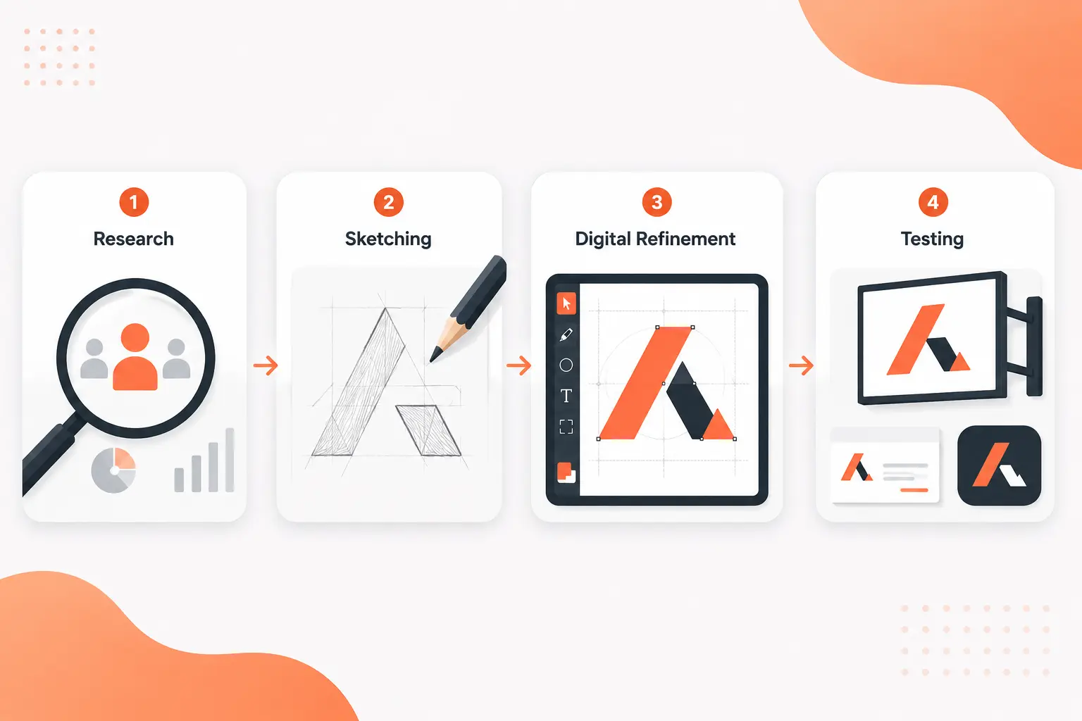
Strong logos begin with research, which defines the audience, competitors and brand values before design decisions take shape. Sketching concepts explores multiple visual directions until one idea stands out. Digital vector refinement transforms that concept into precise, scalable artwork. Testing confirms clarity, recognition and emotional fit before release. Together, these stages produce a logo that represents the brand with clarity and consistency wherever it appears.
What Is Logo Design?
Logo design is the process that creates a unique visual symbol to establish a brand's identity. It combines typography, color theory and shapes to produce a recognizable mark that reflects a company's values and helps people identify the brand at a glance. Every design decision supports clarity, recognition and long-term consistency across different media.
Logo design follows these same principles in successful brands. The FedEx logo uses bold typography and a hidden arrow to represent speed, direction and precision without unnecessary detail. It shows how a simple visual solution can strengthen brand recognition and build customer trust across different markets.
Why is logo design important?
Logo design is important because it creates the face of your business and shapes a strong first impression. It establishes a consistent visual identity that helps customers recognize the brand and remember it over time. A clear and distinctive logo strengthens brand recognition, supports customer confidence and differentiates the business in competitive markets.
Logo design follows the same principles in successful global brands. The McDonald's golden arches show how a simple visual identity creates instant recognition and remains memorable across different countries and customer touchpoints.
The 3 reasons why logo design is important are listed below.
- Instant Recognition: Instant recognition helps customers identify a brand quickly across digital and physical touchpoints.
- Builds Trust: Builds Trust creates confidence through a professional and consistent visual identity that customers recognize over time.
- Communicates Value: Communicates Value expresses the brand's purpose, quality and personality through a clear visual identity.
What makes logo design effective?
Logo design is most effective when simplicity, memorability, versatility, timelessness, and appropriateness work together. These qualities create a distinctive logo that customers recognize, remember and trust across different applications.
Logo design follows the same principles in successful global brands. The Nike swoosh shows how a simple visual mark remains memorable, adapts to different media and reflects the brand's identity with equal clarity in full color and single-color prints.
The 5 qualities of effective logo design are listed below.
- Simplicity: Simplicity removes unnecessary visual details and improves recognition.
- Memorability: Memorability helps customers recall the logo after brief exposure.
- Versatility: Versatility preserves clarity across digital media, print, packaging and signage.
- Timelessness: Timelessness reduces dependence on short-lived design trends and supports long-term recognition.
- Appropriateness: Appropriateness reflects the brand's identity and preserves clarity in single-color prints.
What are the fundamental principles of logo design?
The fundamental principles of logo design are the qualities that make a brand mark clear, memorable and effective across real-world applications. Together, simplicity, memorability, versatility, scalability, timelessness and relevance help the logo represent the brand with clarity and consistency in every format.
Logo design applies these principles to create visual identities that remain effective across different media and customer touchpoints. The Apple logo demonstrates this approach because its simple silhouette stays recognizable at different sizes, adapts across digital and printed materials and remains relevant despite decades of product evolution.
The 6 fundamental principles of logo design are listed below.
- Simplicity: Simplicity removes unnecessary visual details and improves recognition.
- Memorability: Memorability helps customers remember the logo after brief exposure.
- Versatility: Versatility preserves clarity across colors, formats and media.
- Scalability: Scalability maintains legibility from small icons to large signage.
- Timelessness: Timelessness reduces reliance on short-lived design trends.
- Relevance: Relevance aligns the logo with the brand's purpose, audience and brand mark.
What are the essential elements of logo design?
The essential elements of logo design are the visual components that make a brand mark recognizable, functional and aligned with a company's core values. Each element contributes to clear communication, stronger recognition and a consistent brand identity.
Logo design integrates these elements into a cohesive visual identity. The Amazon logo pairs clean typography with a distinctive logomark, a restrained color palette and meaningful negative space. Its arrow connects the letters A and Z, communicates a complete product range and adds a memorable visual detail without increasing complexity.
The essential elements of logo design are listed below.
Simplicity: Simplicity removes unnecessary visual details and improves recognition.
Memorability: Memorability helps customers remember the logo after brief exposure.
Versatility: Versatility preserves clarity across different formats and applications.
Timelessness: Timelessness reduces reliance on short-lived design trends.
Relevance: Relevance aligns the logo with the brand's purpose and audience.
Typography: Typography communicates the brand's personality through carefully selected letterforms.
Color Palette: Color Palette reinforces emotion, recognition and visual consistency.
Logomark or Icon: Logomark or Icon provides a distinctive visual anchor that strengthens identification.
Negative Space: Negative Space improves clarity, balance and visual meaning without unnecessary visual elements.
What are the different types of logo design?
The different types of logo design are the main categories that help businesses match a brand's identity with the most suitable visual style. Each category serves a different purpose, whether the goal is to emphasize a company name, highlight a distinctive symbol or combine multiple visual elements into a single brand identity.
Logo design uses these categories to solve different branding challenges while maintaining clarity and recognition. The Starbucks logo demonstrates this approach through its emblem design, where the circular symbol and integrated wordmark create a distinctive identity that remains recognizable across packaging, storefronts and digital platforms.
The different types of logo design are listed below.
Wordmarks (Logotypes): Wordmarks (logotypes) present the full brand name in a distinctive typeface. Google uses this style to create a simple and recognizable identity.
Lettermarks (Monograms): Lettermarks (monograms) use initials to represent the brand. IBM demonstrates this approach with a compact and memorable letter-based logo.
Pictorial Marks (Symbols): Pictorial marks (symbols) rely on a recognizable image instead of the full brand name. Apple uses a simple apple silhouette that customers identify instantly.
Abstract Marks: Abstract marks use nonliteral shapes to express the brand visually. Nike represents this category through its distinctive swoosh.
Mascots: Mascots feature illustrated characters that give the brand a recognizable personality. KFC uses Colonel Sanders as the central visual element of its identity.
Emblems: Emblems integrate text within a badge, seal or enclosed design. Starbucks uses this format to combine its name with the iconic siren.
Combination Marks: Combination marks unite typography with a symbol in a single logo. Adidas combines its wordmark with the three-stripe symbol to create a flexible brand identity.
How does logo design communicate a brand message?
Logo design communicates a brand message through the visual relationship between its core design elements. Color influences emotion through Color Psychology, Shape and Form define visual structure, and typography expresses personality and tone. These elements create a memorable identity that reflects a company's values and gives customers a consistent impression wherever they encounter the brand.
Logo design demonstrates this process in successful visual identities. The FedEx logo uses clean typography and purposeful negative space to express speed, precision and reliability. Its hidden arrow reinforces the message without additional words or graphics, proving that thoughtful visual decisions communicate meaning clearly.
How do typography choices influence logo design?
Typography choices influence logo design through the way letterforms shape brand perception. Typeface selection establishes the emotional tone, strengthens brand trust and improves visual clarity. Designers refine Font weight, Letter spacing (kerning) and Legibility so the logo remains balanced and readable at every size. These decisions determine whether the identity appears traditional, modern, or playful while preserving consistency across digital and printed materials.
Logo design relies on typography to express a distinctive brand personality. The Coca-Cola wordmark illustrates this principle through its flowing script, which customers recognize instantly and associate with the brand across generations.
How do color choices influence logo design?
Color choices influence logo design through the emotional associations that shape first impressions and influence brand perception. A carefully selected palette supports evoking emotions, communicating brand personality and driving instant recognition across different marketing channels. Red often represents energy and excitement, Blue conveys trust and stability, and Green reflects growth, health, or sustainability. Together, these associations help customers understand a brand before they read its name.
Logo design uses color psychology to reinforce a consistent visual message. The Coca-Cola logo demonstrates this principle through its signature red palette, which creates immediate recognition and reinforces excitement and familiarity. Consistent color use also strengthens brand recall and helps customers identify the logo quickly in different environments.
How do shape choices influence logo design?
Shape choices influence logo design through the visual cues that trigger subconscious psychological reactions and strengthen brand identity. Geometric forms communicate structure and reliability, while organic forms introduce warmth and approachability. Circles and Ovals often represent unity, Squares and Rectangles express stability, Triangles suggest direction and energy, Hexagons communicate efficiency and precision, and Organic Curves create movement and friendliness.
Logo design applies these visual associations to build clear and recognizable identities. The BMW emblem demonstrates this approach through its circular form, which reinforces balance, precision and continuity. This consistent use of shape helps customers recognize the brand quickly and supports a distinctive visual identity across different applications.
How does simplicity affect logo design?
Simplicity affects logo design by reducing visual noise and making a logo easier to recognize, remember and apply consistently. A simple design becomes more memorable, remains easily scalable across digital and physical mediums and preserves clarity regardless of size or format. These qualities improve Recognizability, support Versatility and Scale and strengthen Timelessness, allowing the logo to remain effective as branding needs and design trends evolve.
Logo design benefits from simplicity because every visual element serves a clear purpose instead of competing for attention. The Apple logo demonstrates this principle through its clean silhouette, which customers recognize instantly without relying on intricate details or supporting text. Its consistent form maintains clarity on product packaging, mobile interfaces, websites and large-format advertising, proving that a simple logo can remain functional, adaptable and timeless across diverse applications.
How does scalability affect logo design?
Scalability affects logo design because it requires every visual element to stay simple, clear, and functional across every application. A scalable logo maintains visual clarity on tiny mobile app icons, storefront signage, business cards and large billboards, so designers rely on appropriate line thickness, balanced negative space and a clean visual structure.
Vector formats preserve sharp edges at any size without quality loss, while responsive variations help brands adapt the logo for digital and print media without sacrificing recognition. The Adidas logo demonstrates this principle well because its simple geometry remains recognizable, balanced and readable from small product labels to large advertising campaigns.
How to evaluate a logo design?
Logo design evaluation requires clear standards that determine whether a logo communicates the brand effectively and performs consistently across practical applications. An effective review confirms that the logo supports the brand's identity, remains functional in different environments, and delivers a consistent visual impression. A logo evaluation tool can provide automated technical feedback before practical visual testing verifies real-world performance.
The criteria for evaluating a logo design are listed below.
Simplicity: Simplicity means the logo stays easy to recognize, understand, and remember.
Scalability: Scalability means the logo remains clear and readable at both small and large sizes.
Relevance: Relevance means the logo reflects the brand's identity and meets the expectations of its target audience.
Uniqueness: Uniqueness means the logo stands apart from competitors and avoids confusion with existing brands.
The Blur Test: The Blur Test confirms the logo remains recognizable when visual detail is reduced.
The Monochrome Test: The Monochrome Test verifies the logo retains its impact and clarity in black and white.
The Context Test: The Context Test confirms the logo performs consistently across packaging, websites, signage, mobile interfaces and other practical applications.
What factors influence logo design success?
Logo design success relies on a balanced combination of design principles that help a logo communicate business values clearly and remain effective across different applications. A successful logo builds recognition, adapts to changing environments, and supports long-term brand growth without sacrificing clarity or consistency. Apple demonstrates these qualities well because its simple symbol, restrained color palette, consistent typography and timeless design reinforce a premium brand identity across every touchpoint.
The factors that influence logo design success are listed below.
Simplicity: Simplicity keeps the logo clear, memorable, and easy to recognize.
Relevance: Relevance ensures the logo reflects the brand's message and business values.
Versatility: Versatility allows the logo to perform consistently across digital platforms, print materials, and signage.
Color Choice: Color Choice shapes emotional response and influences brand perception.
Typography: Typography strengthens brand personality while improving readability.
Timelessness: Timelessness helps the logo remain effective without depending on short-lived design trends.
How does logo design evolve over time?
Logo design evolves from complex, ornate illustrations to simpler, flat, and minimalist graphics. New technology, art trends, and small mobile screens encourage this shift because brands need logos that remain clear, recognizable and adaptable across modern applications.
Successful logo evolution preserves a brand's core identity while introducing Smart changes that improve usability without reducing recognition. Pepsi demonstrates this approach because each redesign simplified visual elements while preserving the familiar characteristics that people associate with the brand.
When should you redesign a logo?
Businesses redesign logos when business direction changes, the target audience shifts, or the current design looks outdated. New company direction and outgrown identity often reflect broader business changes, while poor digital fit and inflexible formats reduce performance across modern applications. Airbnb illustrates this transition because its redesign modernized the brand while preserving recognition.
The situations that require a logo redesign are listed below.
New Company Direction: New Company Direction reflects changes to the company's mission, strategy, or market position.
Outgrown Identity: Outgrown Identity shows the existing logo no longer represents the current brand.
Reaching New Buyers: Reaching New Buyers requires a visual identity that connects with a different customer segment.
Outdated Style: Outdated Style makes the logo appear less current than competing brands.
Poor Digital Fit: Poor Digital Fit reduces clarity and usability across modern screens and smaller display sizes.
Inflexible Formats: Inflexible Formats limit consistent use across print, digital media and social platforms.
What should you consider before logo design?
Before logo design, consider the factors that shape an effective and recognizable brand identity. A clear understanding of brand identity, the target audience and market competition helps establish a direction that supports long-term recognition and practical use.
The key considerations before logo design are listed below.
Brand Identity and Values: Brand Identity and Values define what the logo should communicate about the business.
Target Audience: Target Audience identifies the people the logo should attract and resonate with.
Competition and Differentiation: Competition and Differentiation help the logo stand apart within the market.
Versatility and Practicality: Versatility and Practicality ensure the logo performs consistently across different formats and sizes.
Why is logo research important?
Logo research is important because it reduces legal and competitive risks before design begins. It prevents costly legal mistakes, supports Legal safety and uses Competitor analysis to ensure logo design remains unique from competitors while meeting target audience expectations.
How do you choose the right logo style?
The right logo style depends on your brand's characteristics and practical requirements. Matching your brand personality, business name length and multi-platform usability helps determine whether logo design works best as Wordmarks or Lettermarks/Monograms.
Where can you find logo design inspiration?
Logo design inspiration is available on trusted design resources and creative platforms. Dedicated online archives, portfolio platforms, and curated brand galleries such as LogoLounge, Dribbble and Behance help logo design research through real-world examples and diverse visual styles.
Should a logo follow design trends?
No. A logo should not blindly follow design trends. Timelessness, brand identity and versatility provide greater long-term value. Trends work best as inspiration, not a rule, because they can lead to fast obsolescence.
Can a logo use multiple fonts?
Yes. A logo can use multiple fonts when a primary typeface and a secondary typeface work together to establish hierarchy and create contrast. Most logo systems achieve the best results with two fonts because the combination preserves readability and creates a cohesive visual identity.
How many colors should a logo use?
A logo should use one to three colors. A palette with one main color, one support color, and an optional accent color improves recognition while maintaining clarity across different applications. The logo should also remain effective in Black and White.
Which logo file formats should you keep?
Keep both vector and raster logo files for print and digital applications. AI, EPS, and SVG preserve quality at any size while PNG and JPG support websites, presentations, and everyday digital use.
Does every business need logo variations?
No. Not every business needs logo variations. The primary design remains the foundation of the visual identity, while additional versions address space limits, layout shifts, or background contrast without reducing brand consistency.
.svg)
.svg)
.svg)
.svg)